Maths—No Problem!
OVERVIEW
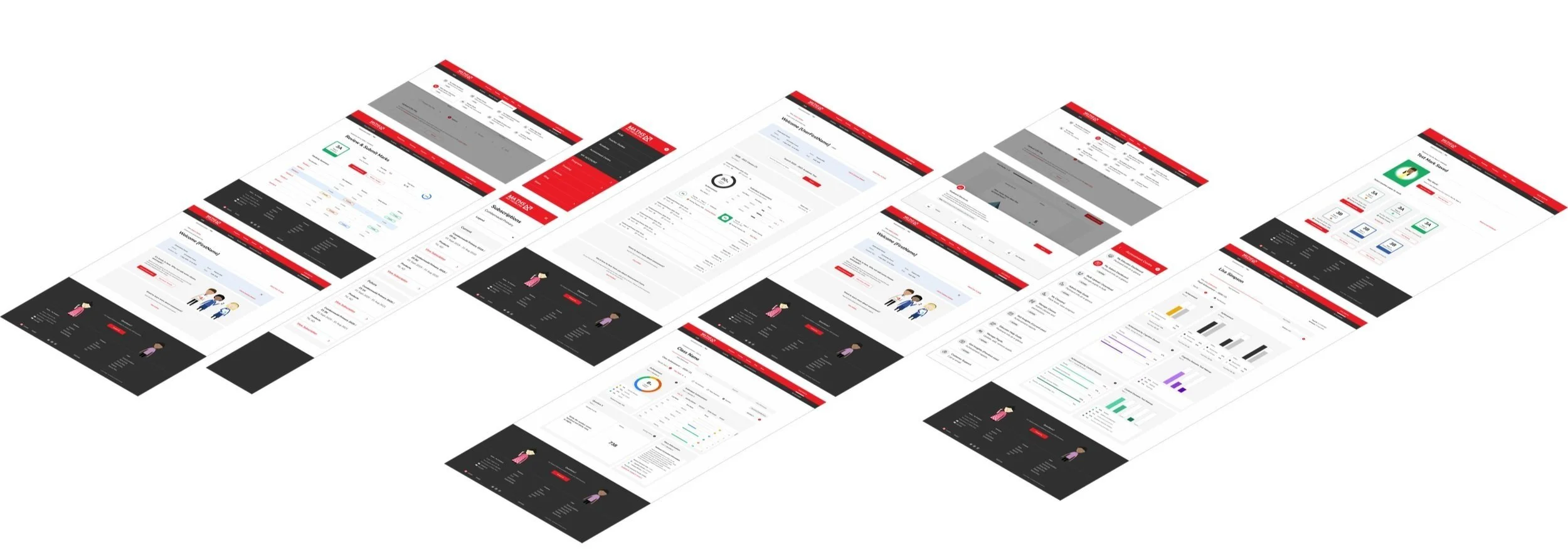
While at Maths — No Problem! (MNP) I collaborated with cross-functional teams to help launch one of the company’s most anticipated products: Insights. As the design lead, I spearheaded the creation and implementation of a unified design system, introduced new design processes, and fostered strong cross-brand collaboration to ensure a cohesive and scalable product experience.
2019 – 2020
UX / Wireframing
Workflow Mapping
Prototyping
UI Design
Accessibility
Design QA
Situation
User Problem
Educators often don’t have the time or tools to fully understand each pupil’s strengths and weaknesses. Marking large volumes of assessments is time-consuming, and extracting meaningful data from results is complex and error-prone—making it difficult to take action based on student performance.
Business Challenge
Years of technical and design debt had slowed product development, causing delays in feature releases and prompting some schools to reconsider their subscriptions. Siloed teams resulted in inefficient workflows, redundant work, and a rise in support inquiries due to inconsistent user experiences.
Target / Goal
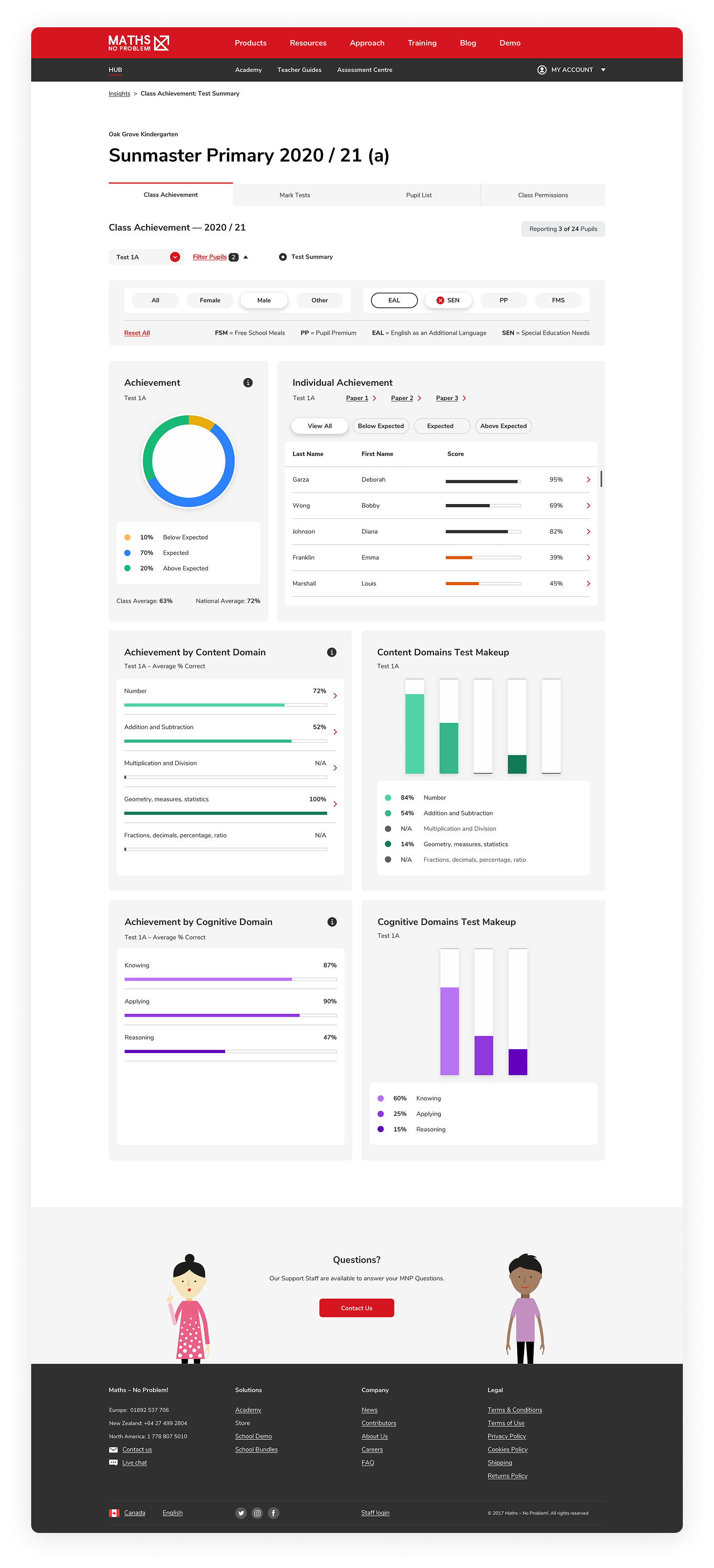
Design a product that enables educators to efficiently mark, review, and assess complex student data—translating it into clear, actionable insights that support pupil progress and reduce the burden on teachers.
APPROACH
Think big, plan, deliver


Audit
→
Learn
→
Collaborate
→
Create rules
→
Execute
→
Test
→
Iterate
→
Audit → Learn → Collaborate → Create rules → Execute → Test → Iterate →
Task
Critical Considerations for Success
To ensure the success of this product, the approach was centred around deep user understanding, thoughtful simplification, and alignment with key functional goals. Each decision was guided by the need to support educators in focusing more on their pupils and less on navigating tools.
Know Your Customer
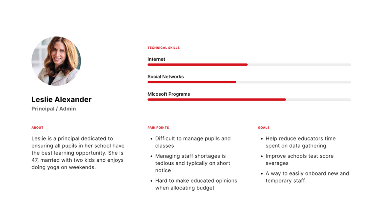
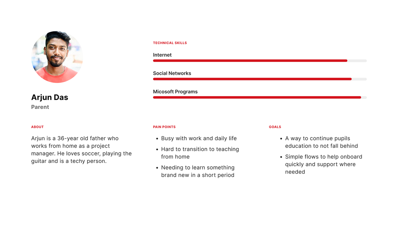
I began by mapping out user personas to highlight the unique needs and overlaps between different user roles, such as admins, educators, and support staff. This allowed me to design distinct yet cohesive user journeys tailored to each role, ensuring the product enhanced educators’ workflow without adding complexity.
Keep It Simple
Educators needed a tool that was intuitive, fast, and actionable. I partnered closely with subject matter experts and real users to understand the core challenges they faced in interpreting and acting on assessment data. These insights informed simplified, efficient workflows that reduced cognitive load and made it easier to take meaningful action.
Overarching Goals
To deliver on both user needs and business objectives, the product design was shaped around these key goals:
Enable admins to easily mass upload and manage user roles
Empower educators to organize and oversee pupils and classes
Simplify class marking with clear and consistent criteria
Provide actionable gap analysis and performance insights
Minimize support inquiries through improved usability
Maintain a consistent, intuitive design language
Ensure speed, accuracy, and accessibility across the experience
Prioritize desktop usage with responsive support for scaling

Actions
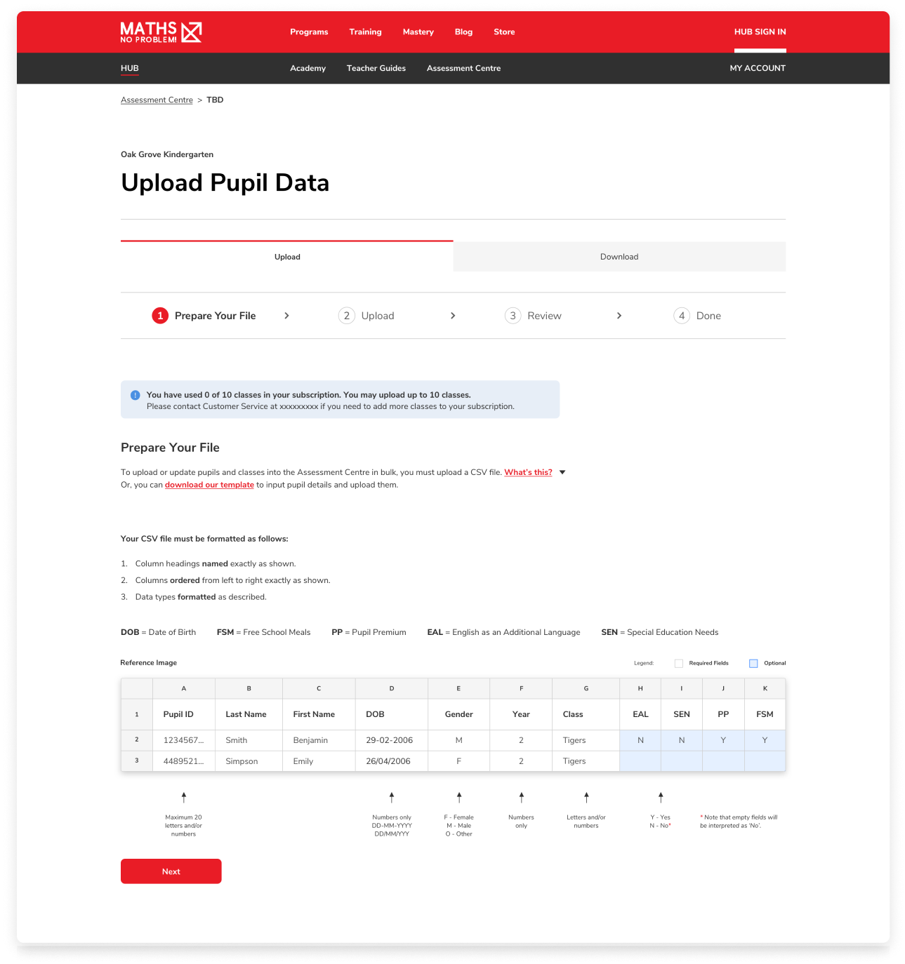
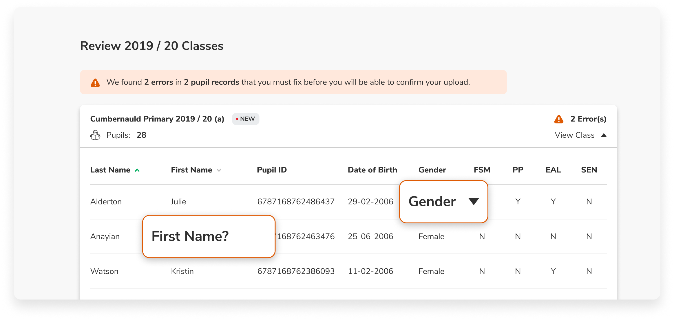
Streamlined Bulk Upload Experience for Admins
To support administrators in efficiently setting up schools, I designed a bulk upload flow that allowed for the quick and accurate import of classes and pupils.
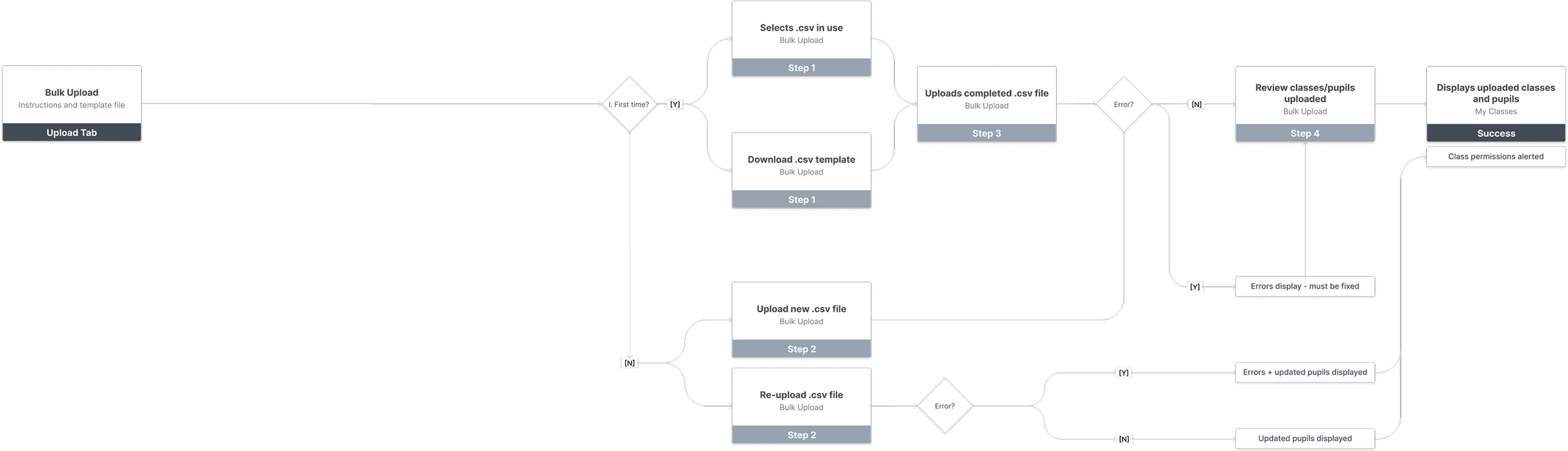
Key actions included:
Designing a clear, step-by-step UX to reduce setup time
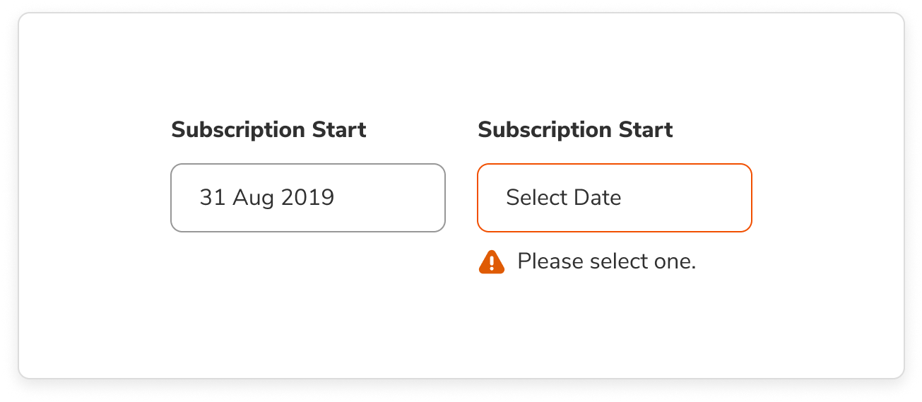
Implementing intuitive error messaging to help users identify and resolve upload issues quickly
Ensuring consistency through a cohesive design system that reinforced usability and trust

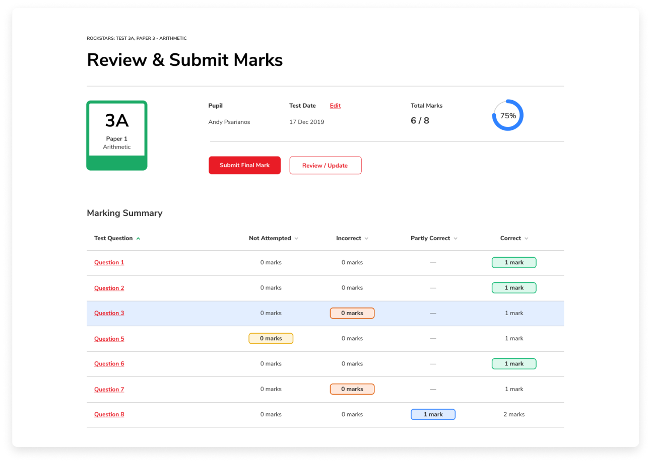
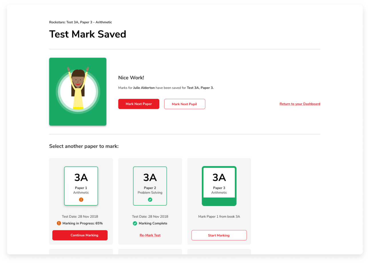
Optimized Marking Flow for Educators
Recognizing the value of educators’ time, I focused on creating a marking experience that was fast, intuitive, and supportive of their real-world workflow.
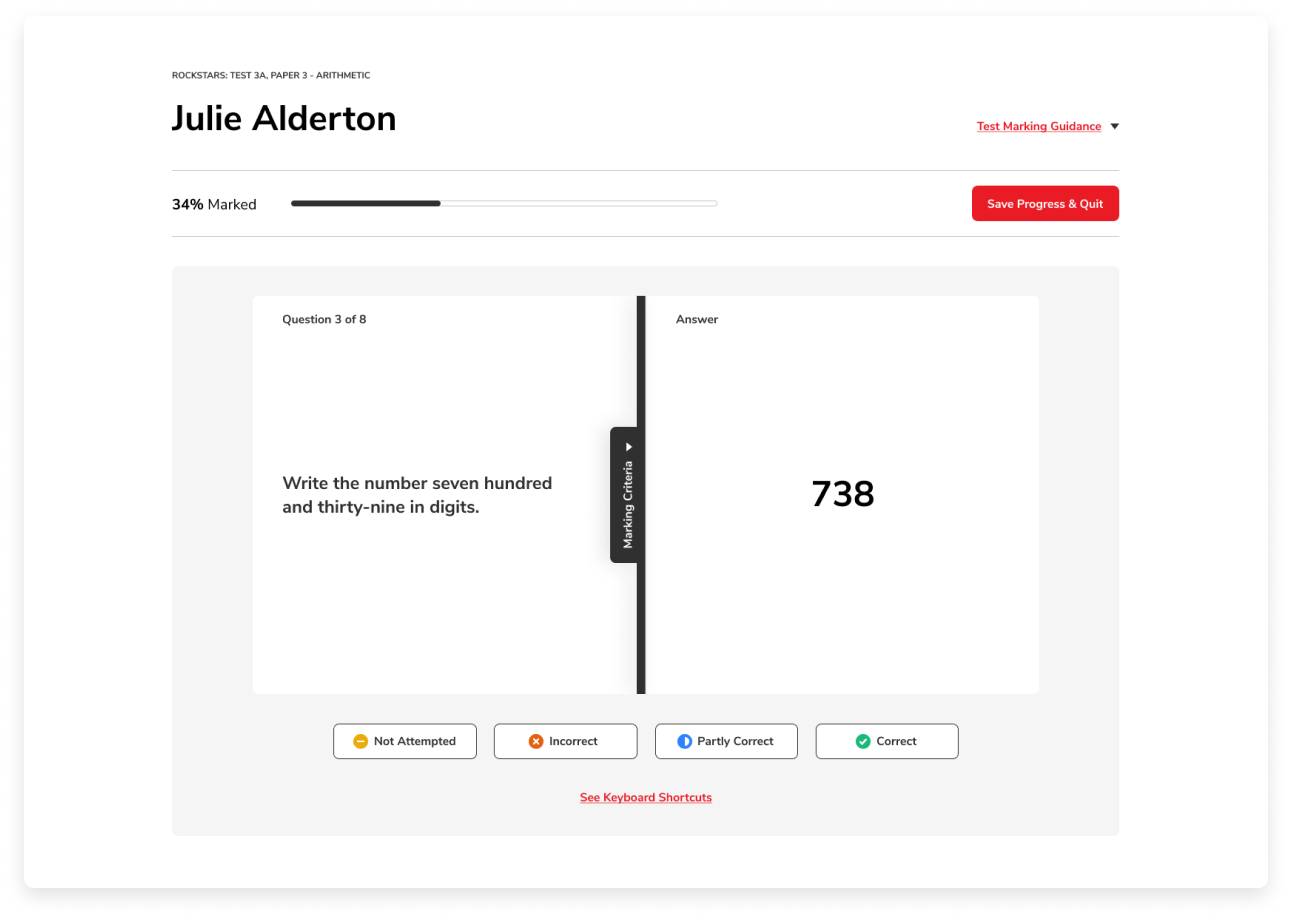

Key actions included:
Acting as an advocate for educators throughout the design process
Conducting research to understand how educators interact with marking tools
Providing clear next steps and actions within the flow to reduce ambiguity
Introducing keyboard shortcuts (hotkeys) to speed up repetitive tasks and increase efficiency

Learning & Adapting
As we approached final testing for Insights, the onset of the COVID-19 pandemic brought rapid and unpredictable changes to the education landscape. With schools shifting to remote learning almost overnight, we needed to quickly pivot to support both educators and pupils—while also extending resources to parents navigating at-home education.
I took ownership of this challenge and led the launch of two new initiatives: Parent Guides and Community—both delivered within six weeks.
Key steps taken:
Identified evolving user needs and clearly defined what success would look like in this new context
Collaborated with subject matter experts and developers to ensure both pedagogical accuracy and technical feasibility
Built a new information architecture to support scalable content
Designed and tested wireframes with input from accredited schools
Iterated based on user feedback and usability testing
Partnered with the development team to implement the final solution
Led design quality assurance (DQA) efforts alongside QA to maintain high standards
Successfully launched both products and established feedback loops for ongoing learning and improvement
Highlights & Results
Impact & Efficiency
Over 43,000 tests were marked in a single month, significantly streamlining educator workflows and saving countless hours of manual effort.
Enhanced product usability led to a 5x reduction in support calls, reflecting improvements in clarity and user guidance.
Quality & Velocity
Delivered a high volume of updates and new features without compromising on quality, maintaining a consistent standard of excellence across releases.
Business Outcomes
The added value delivered through new features and UX improvements drove an increase in school sign-ups, directly contributing to business growth.
Design Leadership & Accessibility
Advocated for inclusive design by challenging legacy decisions—including a strategic shift in the brand’s primary digital colour to meet AAA accessibility standards, improving usability for all users.

Next project: Paycase
Coming soon…